Vancouver homeowners are embracing warmer neutrals, earthy tones, and selective bold accents as the defining paint colours for 2026. Design experts predict a shift away from stark grays toward creams, beiges, and nature-inspired hues that complement the city’s natural surroundings.
Top-Rated Colour Palettes by Design Experts
Design professionals recommend warm neutrals as the foundation for Vancouver interiors in 2026. Cream, beige, and greige dominate expert selections, offering versatility that works with the city’s varied natural light conditions throughout the year.
Benjamin Moore and Sherwin-Williams have released their 2026 colour collections featuring sophisticated earth tones paired with deeper accent shades. These palettes allow you to create cohesive schemes that transition seamlessly between rooms. Behr’s 2026 Color Trends palette includes 20 curated colours designed to work in harmony, making colour coordination straightforward for your home.
Experts emphasize selecting colours that add depth without overwhelming your space. Rich terracotta, warm clay, and muted sage provide personality while maintaining the calming atmosphere Vancouver residents prefer. You can layer these hues with lighter neutrals to achieve balance in rooms with limited natural light.

Influential Colour Trends Shaping Vancouver Homes
Earthy, grounded colours are reshaping Vancouver interiors as homeowners move toward biophilic design principles. Warm greens, terracotta, and clay-inspired shades reflect the natural landscape surrounding the city, from coastal forests to mountain vistas.
Blue continues as a popular choice, particularly in calming mid-tones and deeper navy shades. These colours suit Vancouver’s coastal identity while providing the tranquility many homeowners seek in their living spaces. Plum and sophisticated pink tones are emerging as accent colours, offering unexpected depth in bedrooms and dining areas.
The shift toward warmer palettes represents more than a passing trend. Paint colour consultants note that homeowners are rejecting the cool grays that dominated previous years in favour of colours that create inviting, comfortable environments. This change aligns with Vancouver’s climate, where warmth and coziness matter during rainy seasons.
Community Favourites: Most Popular Choices
Vancouver homeowners favour colours that balance contemporary style with livability. Soft whites with warm undertones remain the most selected neutral, particularly in open-concept spaces where light reflection matters.
Popular 2026 Colour Categories:
- Warm Neutrals: Cream, beige, greige
- Nature-Inspired: Sage green, olive, terracotta
- Calming Blues: Soft sky blue, coastal blue, navy
- Rich Accents: Deep plum, warm rust, clay
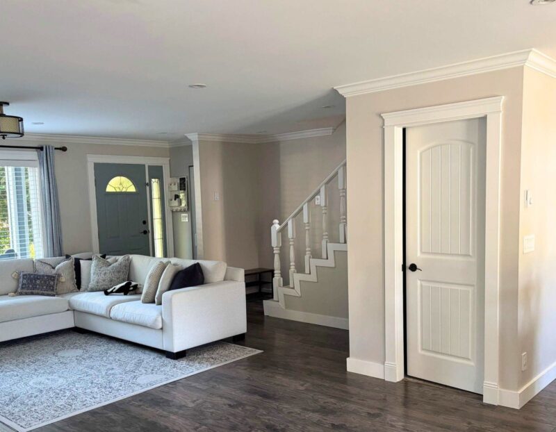
Greige continues as a community favourite for main living areas, offering the sophistication of gray with the warmth of beige. You’ll find this colour particularly effective in condominiums and townhomes where cohesive flow between compact spaces is essential.
Sage and muted green tones are gaining traction in kitchens and bathrooms, replacing the stark white that previously dominated these spaces. These choices reflect Vancouver’s connection to natural surroundings while maintaining a fresh, clean appearance.

Emerging Paint Colour Combinations
Successful colour combinations in 2026 pair warm neutrals with strategic accent colours. Cream walls with terracotta or rust accents create inviting spaces that feel both modern and timeless. This approach works particularly well in Vancouver homes where you want to maximize natural light while adding character.
Pairing soft blues with warm beiges produces a coastal-inspired palette suited to Vancouver’s waterfront neighbourhoods. You can use deeper blue on a single accent wall while keeping surrounding walls in lighter neutral tones. This combination provides visual interest without overwhelming smaller rooms common in Vancouver housing.
Layering different depths of the same colour family creates sophisticated, cohesive interiors. Try combining cream walls with deeper caramel trim, or soft sage with richer olive accents. These monochromatic schemes add dimension while maintaining a calm, unified aesthetic throughout your home.
How Vancouver’s Unique Environment Influences Paint Colour Choices
Vancouver’s coastal location and distinctive climate create specific considerations when selecting interior paint colours, from managing limited natural light during rainy seasons to complementing the region’s natural landscapes. Your paint choices need to work with the city’s environmental factors while reflecting local design sensibilities and sustainable values.
Adapting Colour to Coastal Light and Weather
Vancouver’s grey, overcast skies dominate much of the year, which significantly affects how interior paint colours appear in your home. The diffused natural light creates cooler tones throughout interior spaces, making warm paint colours essential for counterbalancing the lack of direct sunlight.
Lighter neutrals like soft whites, warm beiges, and gentle greys help maximize the limited natural light available during Vancouver’s prolonged rainy periods. These colours reflect available light more effectively than darker shades, preventing rooms from feeling cave-like during winter months.
Recommended colour approaches for Vancouver’s light conditions:
- Warm whites with yellow or cream undertones instead of stark cool whites
- Mid-tone greys with warm bases to prevent rooms from appearing dingy
- Soft blues and greens that echo the natural environment without appearing cold
- Earthy tones like terracotta and warm taupe for depth without darkness
Your paint finish also matters in Vancouver’s climate. Satin and eggshell finishes provide subtle light reflection without the harsh glare of high-gloss options, creating a balanced appearance in rooms with variable natural light throughout the day.
Local Design Preferences and Regional Influences
Vancouver’s proximity to mountains, ocean, and forests shapes interior paint colour preferences across the region. Nature-inspired palettes dominate local design trends, with homeowners gravitating toward colours that create visual connections between indoor and outdoor spaces.
Serene blues remain popular choices, reflecting the Pacific Ocean and coastal atmosphere that defines the city’s geography. These colours work particularly well in bedrooms and bathrooms where calm, restful environments are priorities.
Forest greens and moss tones have gained traction as accent colours, bringing the lush West Coast landscape indoors. You can use these shades on feature walls or in smaller spaces like powder rooms and home offices.
Vancouver’s cultural diversity also influences colour trends, with warm shades inspired by various artistic traditions appearing in neighbourhood-specific design choices. Mustard yellows, deep oranges, and rich burgundies add character to homes while maintaining sophistication.
The city’s contemporary design aesthetic favours clean lines and uncluttered spaces, which translates to sophisticated neutral bases with strategic pops of colour rather than bold, all-over applications.
Eco-Friendly and Sustainable Paint Options
Vancouver homeowners increasingly prioritize environmental considerations when selecting interior paint colours and products. Low-VOC and zero-VOC paints have become standard requirements rather than premium options in the local market.
Several paint manufacturers now offer lines specifically formulated with natural pigments and sustainable ingredients that perform well in Vancouver’s humid coastal climate. These products provide excellent coverage and durability while minimizing environmental impact and indoor air quality concerns.
Key features to look for in sustainable paints:
- Third-party certifications like Green Seal or EcoLogo
- Natural binders derived from plant-based materials
- Mineral-based pigments instead of synthetic alternatives
- Locally manufactured products to reduce transportation emissions
Your choice of lighter, reflective interior paint colours also contributes to energy efficiency by reducing the need for artificial lighting during daylight hours. This consideration aligns with Vancouver’s broader sustainability goals and can lower your home’s energy consumption throughout the year. For homeowners planning updates ahead of 2026, partnering with EB Painting means trend-aware choices, professional results, and a finished space that feels current without feeling temporary.

Frequently Asked Questions
Vancouver homeowners are gravitating toward warm neutrals, nature-inspired tones, and rich accent colours that reflect both current design movements and the city’s unique relationship with its natural surroundings. These choices balance practicality with personal expression while considering the region’s distinctive lighting conditions.
What Are the Trending Interior Paint Colours for Homes in Vancouver This Year?
Warm, earthy tones are leading Vancouver’s interior paint trends in 2026. Forest green, chocolate brown, and soft terracotta shades reflect the city’s connection to natural landscapes. These colours create depth and warmth in spaces that experience varying natural light throughout the year.
Rich espresso hues with burnt umber undertones are gaining popularity for accent walls and feature spaces. Soft lavender and muted sage tones offer calming alternatives that suit Vancouver’s indoor-outdoor lifestyle. Cobalt blue is emerging as a bold choice for homeowners seeking statement colours.
Which Neutral Paint Shades Are Vancouver Homeowners Choosing for Their Living Spaces in 2026?
Layered neutrals with warm undertones are replacing the cool, minimalist greys of previous years. You’ll find taupe, greige, and warm beige creating sophisticated backdrops in Vancouver living rooms. These shades work well with the city’s often overcast skies, adding warmth without overwhelming natural light.
Creamy whites with subtle yellow or pink undertones are popular for brightening spaces. Sand and stone-inspired neutrals provide versatility while maintaining a contemporary feel. These colours allow you to incorporate bolder accents through furniture and decor.
What Bold Paint Colours Are Making a Statement in Vancouver’s Contemporary Interior Designs?
Deep jewel tones are transforming Vancouver interiors with dramatic impact. Emerald green and sapphire blue create sophisticated focal points in dining rooms and libraries. These rich colours pair well with natural wood elements common in West Coast design.
Burnt orange and terracotta bring warmth to modern spaces while nodding to natural clay tones. Charcoal with subtle undertones offers a refined alternative to stark black. These bold choices work particularly well when balanced with lighter neutrals in adjoining spaces.
Can You Suggest some Versatile Paint Colours That Are Popular in Vancouver for Multi-functional Rooms?
Warm greige sits at the intersection of grey and beige, providing flexibility for rooms that serve multiple purposes. This shade transitions seamlessly from daytime work activities to evening relaxation. It complements both cool and warm accent colours, making it ideal for spaces that need to adapt.
Soft sage green offers versatility while maintaining visual interest. Muted clay tones create a grounded feeling that works across different functions and lighting conditions. These colours support various furniture styles and can shift in appearance as natural light changes throughout the day.
What Calming Paint Palettes Are Vancouver Residents Opting for in Personal Spaces like Bedrooms and Bathrooms?
Soft lavender and dusty mauve create tranquil environments in Vancouver bedrooms. These gentle tones promote relaxation without feeling overly cool in the city’s maritime climate. Warm grey-blues reminiscent of coastal fog offer serenity while maintaining connection to the local environment.
Pale sage and muted mint bring nature-inspired calm to bathrooms and sleeping spaces. Warm cream with subtle undertones provides a cocoon-like quality that encourages rest. These shades work particularly well in rooms with limited natural light, adding softness without appearing flat.


