Homes in 2026 lean into colours that feel personal, grounded, and full of quiet confidence. Designers are steering away from flat palettes and moving toward layered hues that shift with daylight. Each shade works harder, creating rooms that feel expressive without overwhelming the senses.
Embracing Rich Jewel Tones like Teals and Plums in 2026 Interiors
Teal and plum step into the spotlight with a richer personality than in past seasons. These shades bring instant dimension, especially in spaces that need warmth without relying on heavier materials. When applied thoughtfully, they create fluid movement across walls and furnishings. Each tone feels luxurious yet surprisingly approachable, allowing homeowners to add drama without changing the architecture. Even a small surface can shift a room’s energy with a deep jewel tone chosen through a thoughtful colour consultation.
Another reason these tones rise is their ability to complement both vintage and modern décor. Teal pairs with brushed brass, while plum softens alongside pale wood. These hues make a room feel collected rather than curated, which is key to 2026 design. Jewel tones also integrate easily into an interior painting update, offering a bold backdrop that still blends with existing textures. With careful placement, they become long-lasting highlights rather than fleeting style choices.

Earth-inspired Greens and Browns Rising As Go-to Neutral Backdrops
Nature-heavy palettes gain momentum as people crave a calmer home environment. Greens with mossy undertones and browns reminiscent of clay or soil serve as grounding bases that outlast rapid style shifts. Instead of flat neutrals, these shades create soft transitions between rooms and make décor elements feel sturdier. They offer a neutral route without defaulting to beige, especially when chosen intentionally through a professional colour consultation.
What surprises many homeowners is how versatile these earthy shades become in an interior painting project. Deep greens bring contrast without being loud, and warm browns blend beautifully with metal, stone, or rattan. These colours behave like visual anchors, especially in open-concept layouts where flow matters. They mimic the serenity of outdoor landscapes, helping rooms feel intuitive and restful.
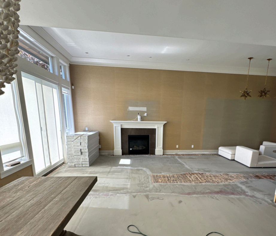
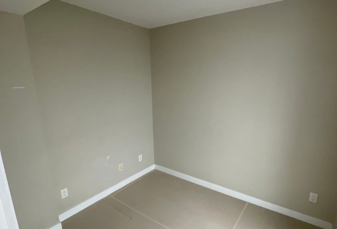
Warm Off-whites and Soft Neutrals Replacing Stark Grey and White Walls
The cool greys of past years give way to softer hues with warm undertones. These off-whites feel more personal and less clinical, creating an inviting canvas for expressive décor. Unlike bright white, warm neutrals adapt to shifting daylight and maintain a cozy impression throughout the year. This shift reflects a desire for subtle comfort rather than strict minimalism.
Soft neutrals also allow homeowners to update their spaces without heavy contrast. They support any palette without stealing focus and make rooms appear brighter without harshness. When paired with textured fabrics or natural wood, these off-whites feel modern but approachable. The result is a timeless base that works well for anyone planning thoughtful interior painting changes.

Bold Accent Walls Using Deep Blues or Mellow Reds to Add Character
Accent walls regain popularity but with more intentional placement. Deep blues command attention without overwhelming the entire room, creating instant focal points around fireplaces, bed frames, or art displays. These shades thrive in spaces that need definition or visual grounding. Even a small accent wall can transform flow when planned through a streamlined colour consultation.
Mellow reds follow closely behind, bringing energy without slipping into overly vibrant territory. They warm up north-facing rooms or spaces lacking daylight, giving them a lively undertone. These accent shades feel rooted in personal expression and help break monotony in rooms dominated by neutrals. When balanced well, bold walls add personality that lasts beyond short-lived styles.
Combining Modern Colours with Natural Materials to Evoke Comfort
The biggest shift in 2026 is how colours and materials interact. Instead of choosing shades in isolation, homeowners pair modern hues with tactile surfaces like stone, wool, cane, or warm wood. This pairing adds a grounded softness that pure colour alone can’t create. Even bold choices become more livable when softened by natural textures.
This fusion also enhances the longevity of an interior painting project. Modern shades—whether muted or vibrant—feel less trendy when placed beside organic materials. Rooms gain depth through contrast, not clutter. The pairing encourages slower, more intentional design choices rooted in comfort and durability.
Using Muted Yellows and Clay Tones for Cozy, Inviting Rooms
Muted yellows return with a hushed glow that brightens rooms without tipping into pastel territory. These tones work well in kitchens, breakfast nooks, and entryways where natural light is limited. Their soft warmth creates a welcoming mood instantly, making them easy favourites for families seeking cheerful spaces. Applied with care, these hues feel uplifting yet grounded.
Clay tones extend this cozy direction, offering warmth with an earthy profile. They adapt well to various décor styles—from modern lines to handcrafted pieces. These shades bring depth to rooms that feel too flat and pair naturally with warm metals or woven textures. Together, clay and muted yellow create environments that feel lived-in and heartfelt.

Harmonizing Colour Palettes Across Rooms for Seamless Home Flow
Rather than treating each room individually, 2026 invites homeowners to consider how colours transition throughout the home. Subtle shifts within a cohesive palette can enhance architectural flow and reduce visual clutter. This approach works especially well in open or semi-open layouts where walls connect across sightlines. With a bit of planning, a colour consultation helps ensure each room maintains its identity while still supporting the overall mood.
Harmonizing colours also makes decorating easier. When each room relates to the next, furniture, art, and textiles blend and age gracefully. It’s a method that encourages long-term design thinking, reducing the need for frequent updates. The result is a home that feels connected yet expressive.
Mixing Subtle Tones with Deep Shades to Balance Light and Depth
A rising technique in 2026 involves pairing gentle tones with dramatic accents. This creates a balanced rhythm across a room, giving it movement without relying on patterns. Soft shades support daylight, while deeper colours anchor the space. This mix works well in rooms with varied lighting throughout the day.
The interplay of depth and softness also highlights unique architectural features. Homeowners can draw attention to niches, shelves, or window frames using deeper colours while keeping the main surfaces light. This balanced layering of shades makes rooms feel richer and more structured.
EB Painting Delivers a Thoughtful, Comfort-Focused Approach to Modern Home Colour in 2026
Bringing these upcoming styles to life requires skill, an eye for detail, and a guiding hand. EB Painting blends expertise with a grounded understanding of what homeowners truly want—comfort, beauty, and longevity. Our team listens first, ensuring every shade supports your lifestyle rather than overwhelming it. With our approach, even bold hues land gracefully and timelessly.
If you’re planning a refresh based on emerging design directions, EB Painting turns inspiration into a cohesive, finished look that feels uniquely yours. Our experience helps you navigate choices with clarity, giving you confidence in every step. Contact us to begin shaping a home that reflects 2026’s most inviting and expressive colour styles.


