Paint has a quiet way of shifting how the eye reads space, shaping rooms into something brighter, taller, and more open. With thoughtful choices and a bit of design intention, any house can feel far more spacious than what’s on the floor plan.
Light Tonal Palettes That Visually Stretch Compact Living Areas
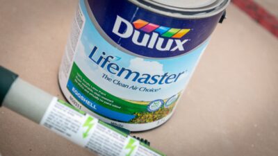
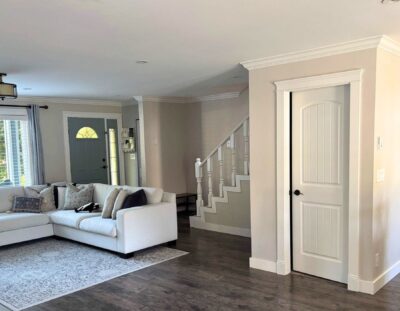
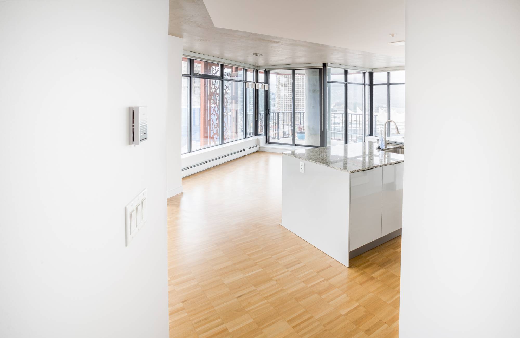
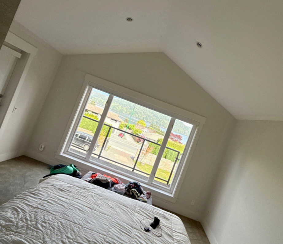
Light tones make walls fall back instead of closing in. Soft creams, airy greys, and pale beiges push boundaries outward and help compact spaces feel less boxed in. These colours bounce light around the room, soften shadows, and reduce the heaviness that deeper colours bring. When homeowners pair these tones with simple décor and minimal clutter, the whole room feels lifted and refreshed. This is often where interior painting makes the biggest impact at the lowest effort.
Using a light tonal palette also helps rooms feel connected rather than isolated. Even transitional areas like hallways benefit because light tones simplify movement between rooms and reduce visual stop points. The gentle shift in tone from one wall to the next encourages a sense of flow, which naturally makes a small home feel larger.
Soft Neutral Walls Creating an Open Flow from Room to Room
Neutral walls create a canvas that blends effortlessly throughout the home. When shades like oatmeal, flax, or mineral grey appear from space to space, the eye moves without interruption. Rooms feel like extensions of one another rather than separate compartments. This trick works especially well in open-concept layouts or older homes that rely on seamless transitions to look bigger. Many homeowners pair these choices with a colour consultation to keep the tones cohesive.
Soft neutrals also welcome bolder accents without shrinking the room. Furniture, textiles, and artwork stand out while the walls fade into the background. This balance keeps things interesting without compromising the illusion of spaciousness. The more unified the walls feel, the more the house reads as open and airy.
Cool Undertones Enhancing Depth and Spaciousness Indoors
Cool undertones—like faint blues, greys, or greens—quietly expand a room. These colours create an impression of distance, similar to how the horizon appears further away in nature. As a result, rooms feel deeper and more layered, especially when paired with strategic lighting. Homeowners often find that cool undertones add a refreshing calm that warms tones can’t always achieve.
The effect becomes even stronger when cool tones connect multiple areas of the home through intentional interior painting efforts. Shadows appear gentler, and corners recede instead of feeling tight or harsh. Even a small space like a bathroom can gain surprising depth with the right cool undertone.

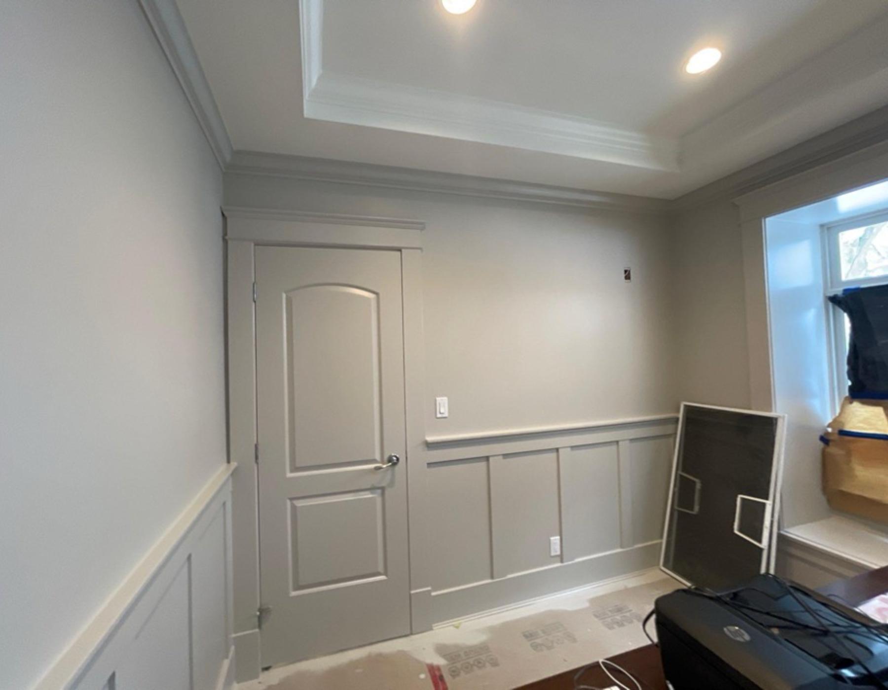
Unified Colour Schemes Reducing Visual Breaks in Smaller Homes
A unified colour scheme minimizes contrast, which is a key factor in creating visual spaciousness. When walls, trims, and doors share similar tones, rooms feel less chopped up and more like one continuous environment. Instead of the eye stopping at harsh shifts, it glides through the home without interruption.
A cohesive scheme also helps hallways and narrow passages feel wider. When the same colour flows from room to room, the home reads as a larger whole. This strategy works especially well in compact houses that rely on smart design choices rather than major structural changes.
Low-contrast Trims Blending Edges for a Wider Room Effect
Bold trim can look beautiful, but it often shrinks a room. Low-contrast trim takes the opposite approach by blending with the wall colour to reduce harsh lines. This softens edges and keeps visual boundaries subtle, giving the impression of extra width and height. Even a small adjustment in tone between the walls and trim can significantly change the room’s feel.
Low-contrast trims also modernize older homes without removing character. By toning down the contrast, the architecture stays visible but no longer limits the sense of space. Homeowners who choose softer trims often notice their rooms feel calmer and better balanced.
Vertical Paint Accents Guiding the Eye Upward for Height
Vertical elements help rooms look taller by pulling the eye upward. This can be done through vertical stripes, tall paneling, or even a single accent wall painted in a slightly deeper tone. The technique adds height without altering anything structural. When used sparingly, it delivers an elegant heightening effect.
These accents pair well with subtle décor and uncluttered layouts. They create an upward rhythm that helps ceilings feel farther away. Vertical accents also allow homeowners to introduce small touches of a favourite colour trend while still keeping the room feeling open.
Satin Finishes Reflecting Light to Brighten Tight Interiors
Satin finishes add a gentle sheen that reflects light around the room. This bounce brightens corners and softens shadows, turning tight spaces into something more breathable. Satin is especially helpful in rooms with limited natural light, making them feel more welcoming.
Because satin finishes amplify light, they pair well with pale tones and cool undertones. The slight reflection adds dimension without looking glossy or overwhelming. Many homeowners choose this finish in hallways, kitchens, or narrow living areas.
Muted Colour Trends Shaping Calm, Expansive Interior Spaces
Muted tones—dusty blues, earthy clays, soft sages—offer depth without overpowering the room. They keep the space feeling grounded while still giving it personality. These colours follow modern colour trend shifts toward softer, nature-inspired palettes that expand a room through balance rather than brightness.
Muted tones also create a soothing environment that feels open yet warm. They work especially well in bedrooms and living rooms, where calmness and spaciousness matter most. Their quiet presence makes them ideal for homes aiming for subtle sophistication.
Transform Your Home’s Atmosphere With EB Painting and Bring Spacious, Beautiful Rooms to Life Through Expert Colour Planning
EB Painting helps homeowners create interiors that feel larger, brighter, and more inviting through thoughtful colour planning and high-quality craftsmanship. Our team understands how shades, undertones, and finishes work together to shape a room’s atmosphere and make a home feel renewed. If you’re ready to refresh your space with expert guidance and results that elevate every room, contact us to work with EB Painting and bring a spacious, modern look to your home.