The change in Vancouver’s light this time of year turns the city into a painter’s palette. As clouds settle lower and rain softens the skyline, homes become cozy retreats filled with mood, warmth, and texture. Choosing the right fall colours can transform these spaces, balancing the natural greys of the season with tones that bring comfort and depth indoors.
Misty Grey Blending Seamlessly with Coastal Weather
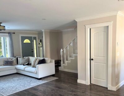
Few colours fit Vancouver’s autumn landscape better than misty grey. It mirrors the overcast skies and wet mornings without feeling dull. This shade pairs well with clean architectural lines, brushed metal fixtures, and natural wood floors. It softens corners, blurs shadows, and feels modern yet grounded. Using this tone in main living areas can create a calm backdrop for deeper hues and layered fabrics.
What many don’t realize is how misty grey behaves with texture. Matte finishes absorb light, adding quiet sophistication, while satin finishes reflect just enough to brighten small rooms. In interior painting projects, this balance makes the home feel unified with the moody weather outside while maintaining a sense of calm refinement indoors.
Cool Sage Bringing Calm to Shared Rooms
Cool sage is the colour of stillness. It invites a sense of rest that suits living rooms, kitchens, and hallways—spaces where people gather. The green undertone feels fresh without being bold, balancing modern design with natural comfort. Paired with oak trim or rattan furniture, sage creates an inviting rhythm that feels connected to Vancouver’s natural landscape.
Lighting changes the way this shade feels from morning to evening. Under daylight, it appears crisp and airy; by night, it turns cozy and slightly smoky. Homeowners often find this tone helps shared rooms feel balanced, making it an excellent choice for interior painting where the goal is subtle harmony rather than high contrast.
Terracotta Accents Balancing Modern Minimalist Rooms
Terracotta, once thought of as traditional, has become a warm counterpoint to minimalist spaces. The colour carries energy from natural clay and brings depth to crisp white or neutral interiors. A single terracotta wall or a few accent pieces can make an otherwise simple room feel grounded and lived-in. It works beautifully in rooms with concrete floors or metal detailing.
The key to using terracotta well is restraint. Its richness stands out when surrounded by lighter materials like birch, marble, or woven textiles. With proper balance, this earthy hue becomes an anchor point that softens sharper lines and cooler tones—perfect for autumn when homes crave a touch of warmth without losing their contemporary edge.

Neutral Foundations That Age Gracefully Through the Season
Neutral colours might seem predictable, but their true power lies in flexibility. Taupe, warm beige, and muted sand shades evolve gracefully from early fall to winter without feeling outdated. These tones make an ideal base for shifting décor—throw blankets, greenery, or art—allowing easy updates as the season changes.
Unlike stark white, neutral foundations respond better to Vancouver’s filtered daylight. They prevent rooms from looking flat or cold during darker months. For long-term appeal in interior painting, a soft neutral base gives homeowners the freedom to experiment with accent colours later while maintaining a timeless aesthetic.
Forest Undertones Complementing Urban Textures
Rich forest tones like pine, moss, and juniper blend the city’s sleek lines with its surrounding nature. These deeper greens are sophisticated and surprisingly adaptable. They pair effortlessly with brass fixtures, linen drapes, and dark woods, creating an upscale yet organic atmosphere. In dining areas or offices, forest shades encourage focus and tranquility.
Adding forest undertones isn’t about making rooms darker—it’s about giving them weight. Applied to one wall or through cabinetry, they introduce visual depth that mirrors the Pacific Northwest’s evergreen landscape. Many designers in Vancouver use these hues to offset industrial materials, bridging the contrast between urban style and natural influence.
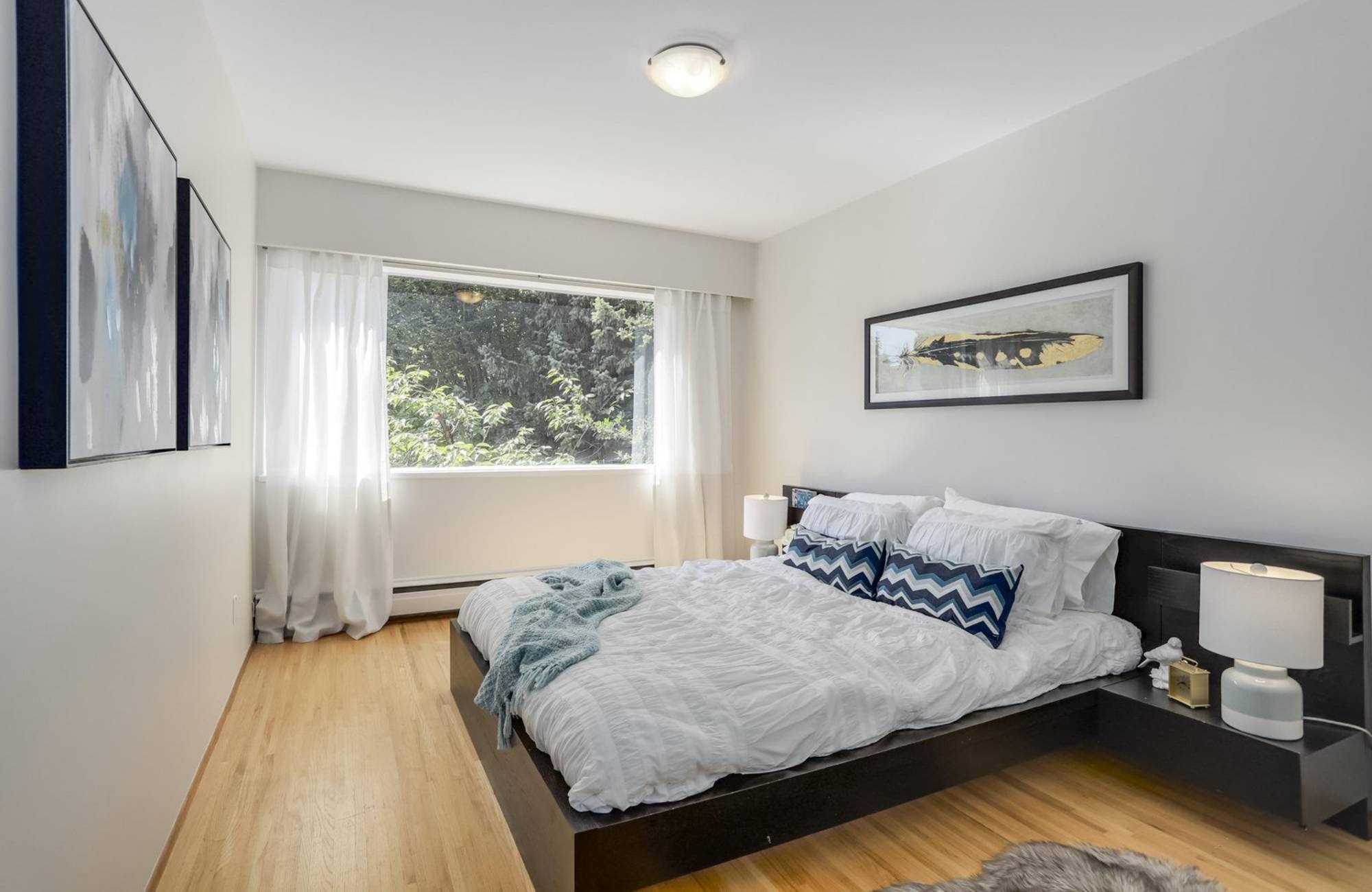
Soft Cream Finishes Brightening Shorter Fall Days
As daylight hours shrink, soft cream tones help capture every bit of available light. Unlike stark whites, creams hold warmth and make interiors feel expansive even under cloudy skies. They bounce natural light gently, avoiding glare while keeping rooms bright and welcoming.
A soft cream base gives flexibility to experiment with textures—linen curtains, wool throws, and ceramic details pop beautifully against it. For interior painting, this colour also masks subtle wall imperfections better than pure white. The result is a space that feels fresh through fall yet transitions effortlessly into winter’s coziness.

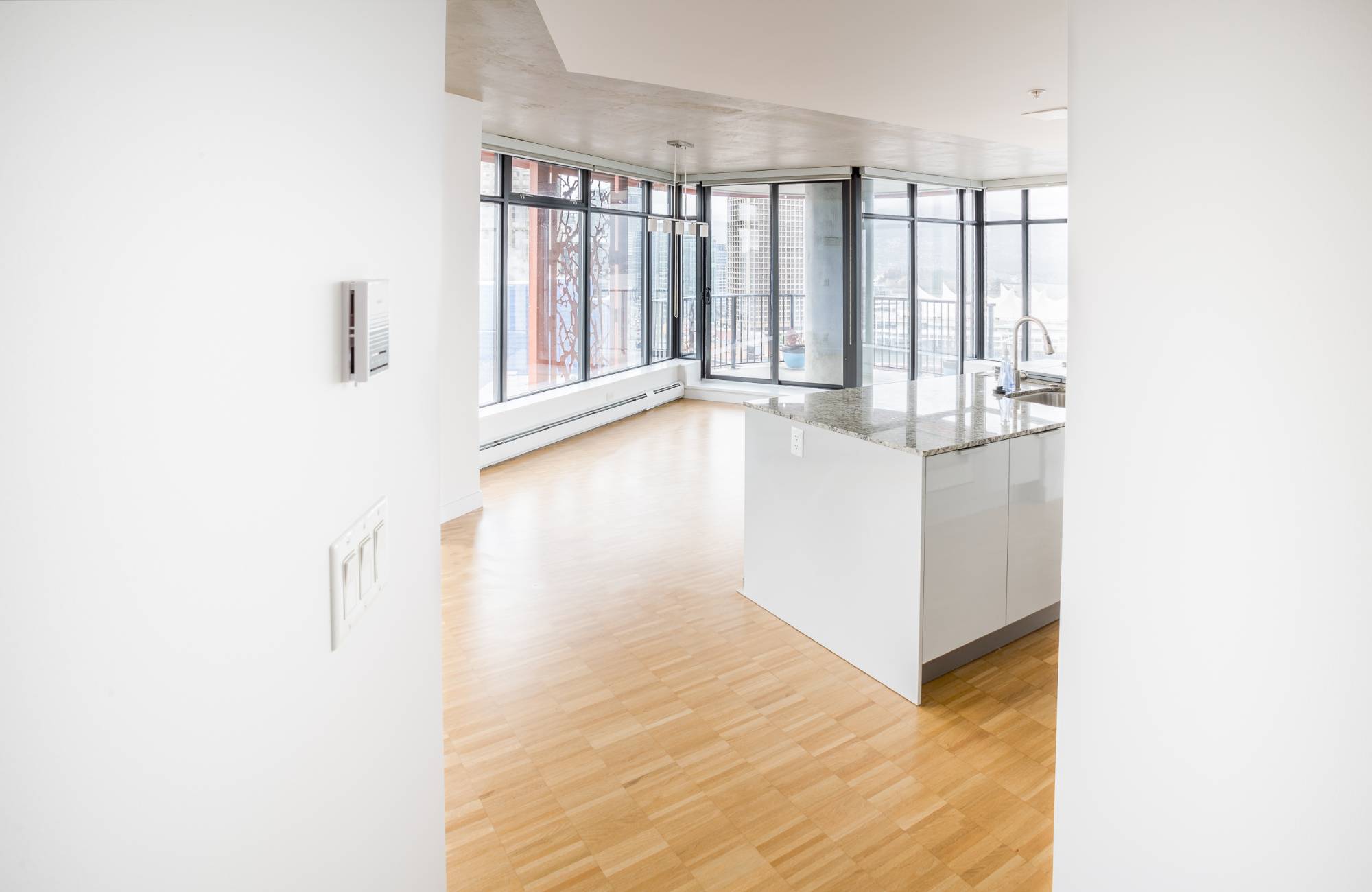
Can Natural Light Change How Colours Feel
Absolutely. In Vancouver, where light shifts dramatically between rain and sun, the same colour can appear completely different throughout the day. Northern-facing rooms often cool colours down, making blues and greys feel sharper, while southern exposures warm them up. Before painting, it helps to test swatches on multiple walls and observe them under morning, afternoon, and evening light.
Many homeowners underestimate how overcast weather transforms tones. Muted colours can appear richer in cloudy light, while bright shades sometimes lose definition. Understanding these shifts ensures your chosen palette stays consistent year-round, which is especially important for maintaining balance during the long, dim fall season.
How Texture and Finish Shape Fall Interiors
Colour isn’t just what you see—it’s how it behaves on a surface. Matte finishes create softness and absorb light, while glossy finishes add energy and reflect brightness. For fall, combining both creates harmony: matte walls with satin trim or semi-gloss cabinetry keep spaces dynamic. This balance makes rooms feel layered and visually rich without adding clutter.
Texture also plays a huge role in how colours are perceived. Pairing smooth walls with rough fabrics or grainy wood adds dimension that pure paint can’t achieve alone. In Vancouver homes, where natural light is ever-changing, these textural differences help colours stay interesting even during the greyest weeks.
Transform Your Vancouver Home with EB Painting for a Fresh, Seasonal Interior Paint You’ll Love
Colour is more than decoration—it’s atmosphere, energy, and identity. Choosing the right palette this fall means blending warmth with sophistication, light with shadow, and style with comfort. Every wall can tell a story that fits your home’s rhythm and the city’s coastal charm. EB Painting brings expertise in understanding how colour interacts with Vancouver’s unique light and architecture.
Whether you’re updating a single room or reimagining your whole space, our team brings precision, creativity, and craftsmanship to every interior painting project. Contact us today to schedule a consultation and bring your autumn-inspired vision to life with professional care and vibrant results that last well beyond the season.