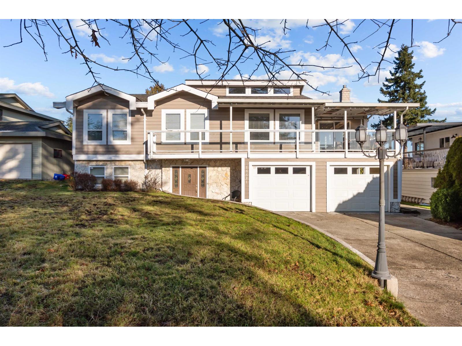
Every home has a personality, and the right colour palette brings it to life. Vancouver Specials have a distinct architectural style that deserves more than a basic coat of paint. Choosing colours that suit the home’s structure, surrounding landscape, and natural light can completely change its appearance while giving it lasting curb appeal. Here are colour combinations that do more than look beautiful—they highlight the character that makes these homes stand out.
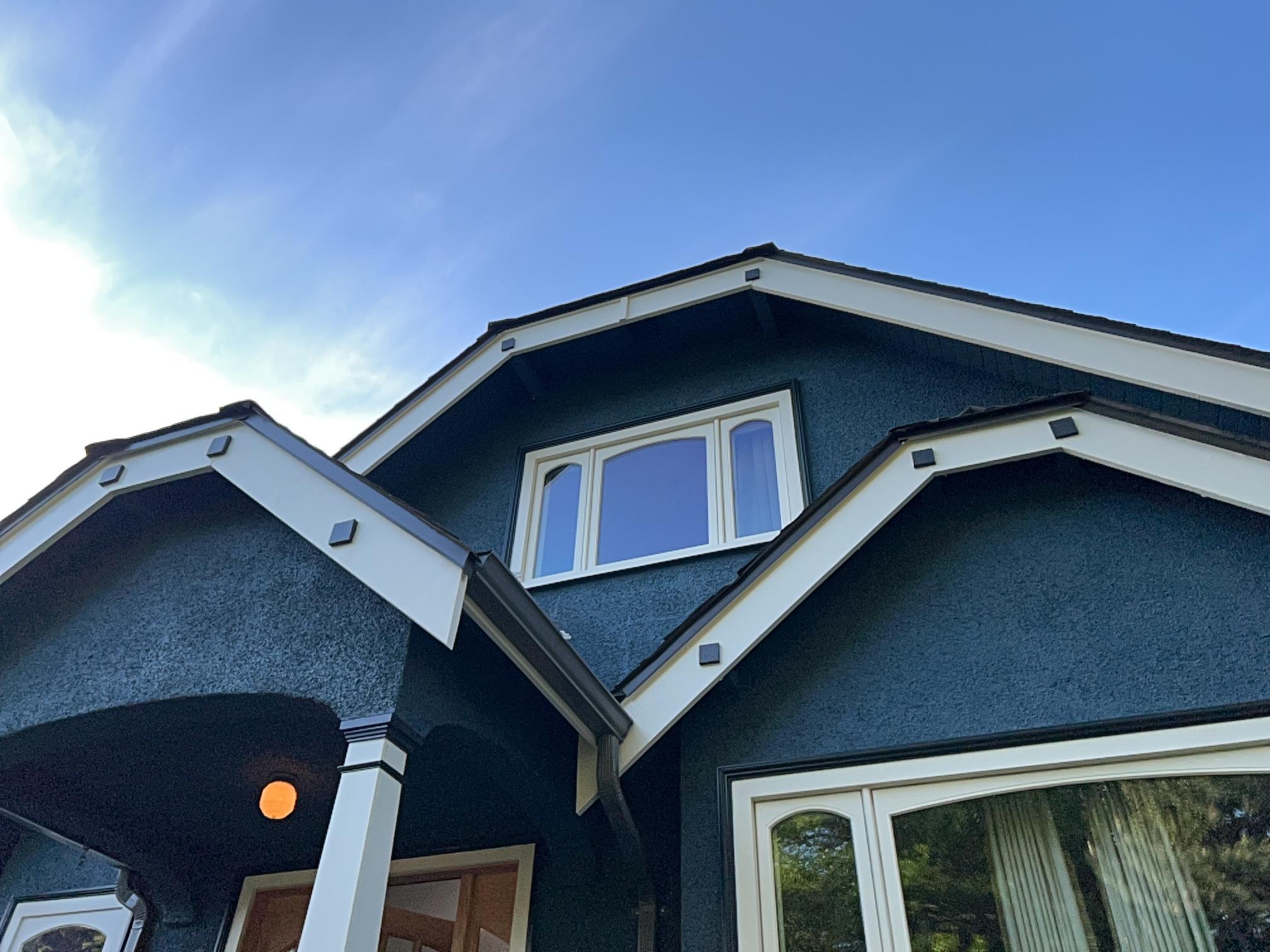
Greige and Carbon Black for Contemporary Vancouver Specials
Greige has become a favourite because it combines the warmth of beige with the clean look of gray. On a Vancouver Special, this balanced shade softens the home’s bold shape while keeping it fresh and modern. Pairing it with carbon black on window frames, trim, or railings creates sharp definition without making the exterior feel too dark. The contrast gives the home a polished appearance that fits comfortably in both established neighbourhoods and newly updated streets.
This pairing also works well across changing seasons. Bright summer days bring out the warmth in greige, while rainy weather allows the darker accents to stand out with confidence. Homeowners often overlook how much window trim and entryways influence the overall look, yet these details become striking when finished in black. The result feels elegant, timeless, and carefully planned without relying on bold colours that may fall out of style.
Warm Taupe and Alabaster with High-LRV Interior Finishes
Natural light changes throughout the day, especially in coastal climates, making interior colour selection more important than many people realize. Warm taupe provides enough richness to add character while keeping rooms comfortable and welcoming. When paired with soft alabaster walls or trim featuring a high light reflectance value, the space feels brighter without appearing cold or overly white.
This combination also complements many flooring styles, from hardwood to luxury vinyl and natural stone. Furniture, artwork, and decorative accents become easier to coordinate because the walls create a calm background instead of competing for attention. Families who enjoy updating décor over time appreciate how flexible this colour pairing remains, allowing seasonal changes without the need for frequent repainting.
Sage Green and Soft Linen for Balanced Chromatic Harmony
Sage green introduces a quiet connection to nature without overpowering the home’s architecture. It reflects the surrounding trees and gardens found throughout many Vancouver neighbourhoods while creating a relaxed atmosphere inside and out. Soft linen adds warmth that keeps the overall design feeling comfortable rather than overly modern, making this pairing especially appealing for homeowners who appreciate understated elegance.
The beauty of this palette lies in its versatility. It works equally well in living rooms, bedrooms, kitchens, and selected exterior details. Natural wood furniture, stone features, and indoor plants blend effortlessly with these shades, creating a home that feels cohesive from one room to the next. Instead of chasing colour trends, this combination offers lasting appeal that continues to look fresh for years.

Charcoal, Cedar, and Off-White Exterior Contrast Systems
Homes with strong architectural lines benefit from colour schemes that highlight depth rather than flatten it. Charcoal creates visual structure across larger surfaces, while natural cedar introduces warmth through garage doors, porch columns, or decorative siding. Off-white trim softens the overall appearance and prevents darker colours from overwhelming the home’s design.
This combination also complements Vancouver’s surrounding environment. Mature trees, landscaped gardens, and natural stone walkways work beautifully beside warm wood and neutral finishes. The contrast feels sophisticated without becoming overly dramatic, helping the property stand out while still fitting naturally within the neighbourhood. It is an excellent option for homeowners seeking a refined exterior with lasting character.
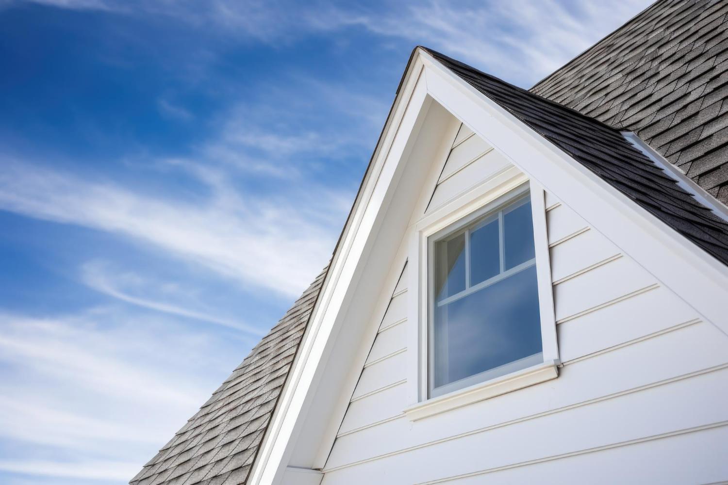
Blue-Gray and Warm Ivory for Coastal Light Optimization
Coastal daylight has a unique quality that changes throughout the seasons. Blue-gray responds beautifully to softer skies by adding subtle depth without making the home feel gloomy. Warm ivory balances the cooler tone and keeps entrances, trim, and architectural details looking inviting even on overcast days.
Many homeowners underestimate how lighting influences colour perception. Shades that appear perfect in a showroom can look completely different once applied outdoors. This pairing remains consistent under varying conditions, creating a welcoming appearance whether the sun is shining or clouds fill the sky. It also complements metal roofing, stone accents, and contemporary landscaping with ease.
Olive Undertones with Sandstone Neutrals for Visual Depth
Homes surrounded by mature landscaping benefit from colours inspired by the natural environment. Olive undertones echo nearby trees and shrubs while adding quiet richness that changes throughout the day. Sandstone neutrals soften the overall appearance, preventing darker shades from making the property feel too heavy or enclosed.
The layered effect created by these colours gives flat surfaces greater visual interest. Entryways become more inviting, architectural features stand out naturally, and the home develops a balanced appearance from every angle. Rather than drawing attention through bright colours, this palette creates depth through subtle contrast, making it ideal for homeowners who appreciate understated beauty.

Deep Navy and Quartz White for Architectural Definition
Deep navy offers a bold yet classic alternative to standard charcoal or black. Used thoughtfully on siding, feature walls, or front doors, it creates striking contrast against crisp quartz white trim. This pairing emphasizes rooflines, windows, and exterior details while maintaining an elegant appearance that suits both traditional and updated Vancouver Specials.
The combination also delivers impressive curb appeal without relying on trendy colours. Navy provides enough depth to create visual interest while remaining timeless. White accents brighten the overall design, allowing the home’s architectural features to take centre stage instead of disappearing into a single colour. Together, they create a polished finish that feels both welcoming and sophisticated.
Earth Pigments with Cool Neutrals for Timeless Façade Appeal
Earth-inspired shades continue to remain popular because they reflect the natural beauty surrounding British Columbia homes. Soft browns, clay-inspired tones, and muted mineral colours create warmth without becoming overpowering. When balanced with cool neutrals on trim and secondary surfaces, the exterior gains a clean, updated appearance while preserving its classic charm.
This palette also adapts well to future updates. New landscaping, lighting fixtures, roofing materials, and outdoor décor blend naturally with these colours instead of competing against them. Homeowners who plan to stay for many years appreciate the flexibility this combination offers, making it a practical investment that continues looking attractive as styles evolve.
Give Your Vancouver Special a Fresh New Identity with the Expert Craftsmanship of EB Painting
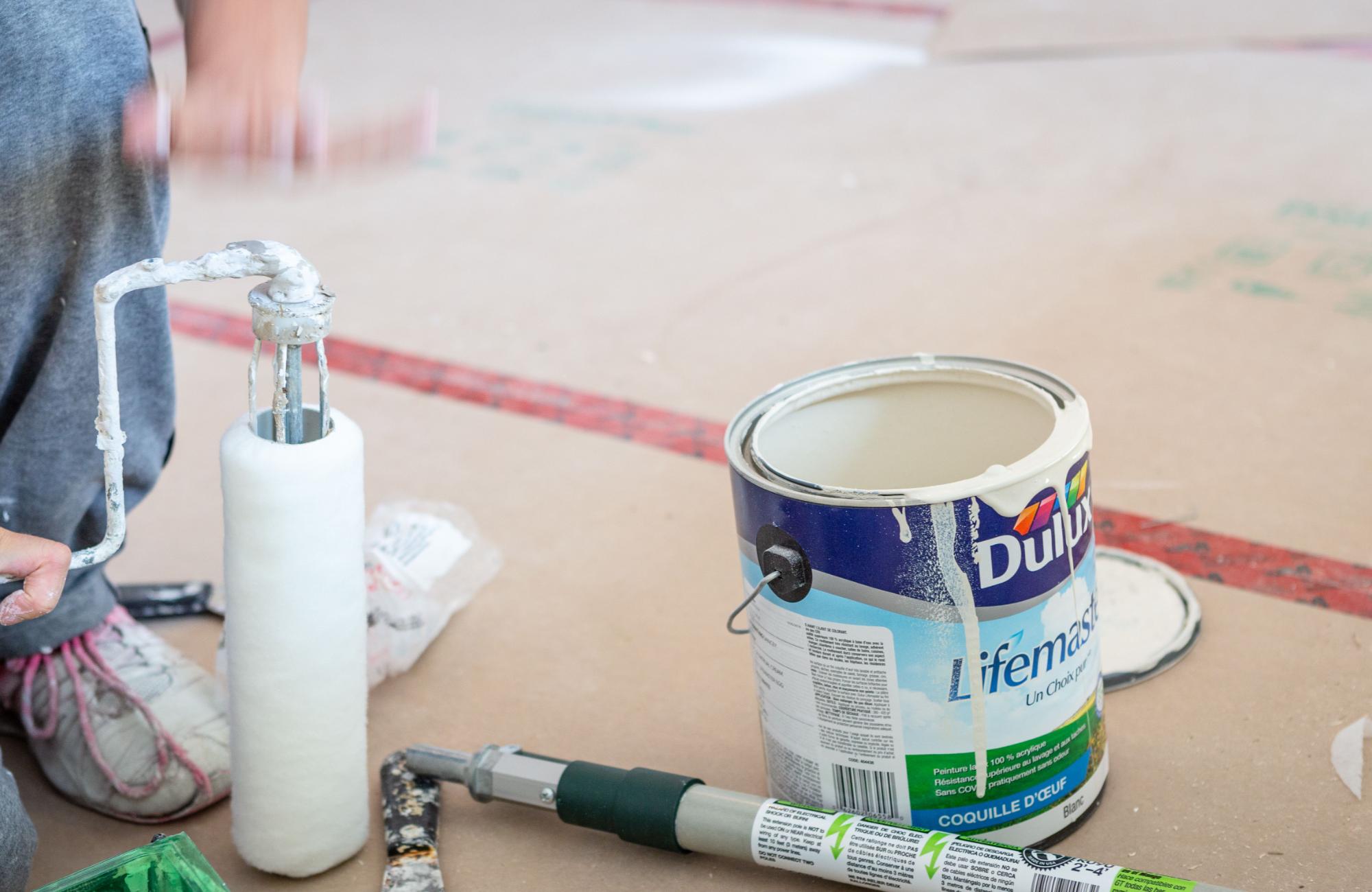
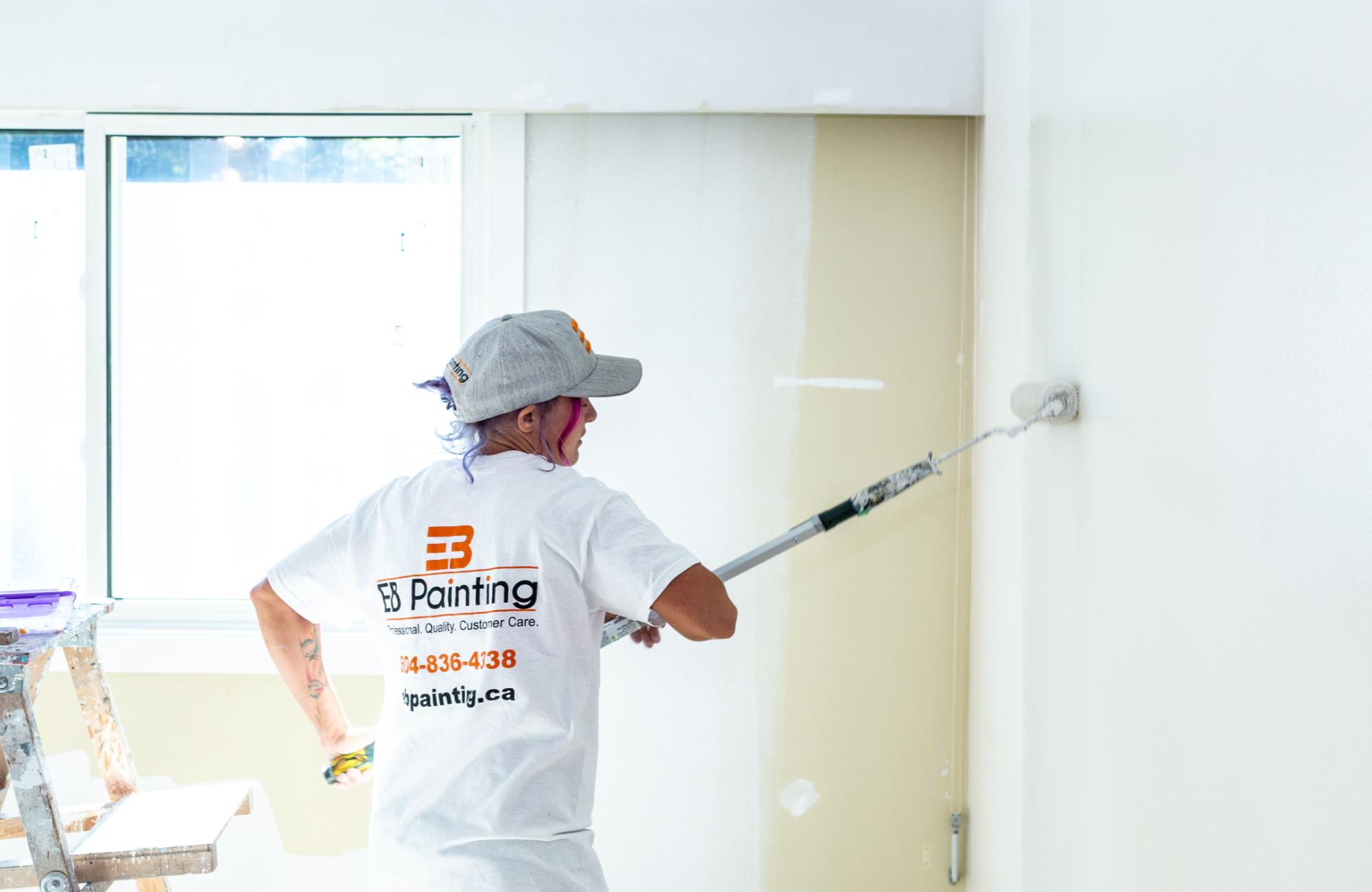
Choosing the right colours is only part of creating a beautiful home. Proper surface preparation, quality materials, and professional application all play an important role in achieving a finish that lasts. Whether you’re refreshing a single room or updating your entire exterior, experienced painters help ensure every detail looks clean, even, and professionally completed.
At EB Painting, we understand how to bring out the best in Vancouver Special homes with colour combinations that complement their unique architecture and surrounding environment. Our team delivers careful workmanship and results designed to enhance your home’s beauty for years to come. Contact us today and let us help transform your home with a finish you’ll be proud to come home to.