Painting your home is more than just adding a splash of color; it’s about transforming spaces into reflections of your personality and lifestyle. The right colors can make rooms feel inviting, cozy, and even more spacious. With a little guidance, you can create a home environment that feels tailored to you. Let’s explore how to pick the perfect colors for different areas of your home and discover the magic that interior painting can bring.
Choosing Colours That Reflect Your Personal Style
Your home is a direct extension of who you are, and the colors you choose should reflect that. Whether you’re into modern minimalism or prefer something more eclectic, color plays a massive role in expressing your personal taste. Take some time to consider what resonates with you—do cool blues make you feel relaxed, or do you gravitate toward bold reds for a pop of excitement?
It’s easy to get caught up in trends, but your choices should always circle back to what feels authentic. Don’t be afraid to mix and match; it’s your space, after all. When interior painting reflects your personality, every room becomes a mini gallery of who you are, and there’s no better feeling than walking into a space that feels uniquely you.
Accentuating Space with Bright and Bold Tones
If you’re dealing with smaller rooms or spaces that need a boost of energy, bold and bright colors can work wonders. Yellows, oranges, and vibrant greens are fantastic choices for areas where you want to create a sense of liveliness. These colors make the walls feel like they’re reaching out, giving the illusion of a more expansive room.
Bold doesn’t have to mean overwhelming. A well-placed feature wall or a strategic burst of color on your trim can accentuate the space without taking over the room. A pop of bright tones in key areas of your home can provide that fresh, modern feel while making your rooms seem bigger and brighter.

Bringing Warmth to Your Living Room with Soft Neutrals
The living room is often the heart of the home, and it should feel cozy and inviting. Soft neutrals—think taupe, beige, and pale grays—are perfect for creating a warm, welcoming atmosphere. These shades work well with almost any decor, making your furniture and accents the stars of the show without competing for attention.
Another advantage of using soft neutrals in interior painting is their versatility. Whether your living room features a classic design or a more contemporary feel, these hues provide a flexible backdrop that can be adapted with colorful cushions, artwork, or throws. This balance of warmth and style makes neutrals a go-to for those seeking an effortless, yet impactful, color choice.
Transforming Bedrooms into Relaxing Retreats with Cool Shades
When it comes to bedrooms, tranquility is key. Cool shades like light blues, soft greens, and gentle lavenders create a calming environment that’s perfect for winding down at the end of the day. These colors are known for their soothing qualities, helping to foster a sense of relaxation and rest.
Another bonus of using cool tones in the bedroom is how they work with natural light. Soft blues and greens can reflect natural light in a way that makes the room feel airy and open, while still maintaining a restful vibe. Choosing the right cool shades for your bedroom can turn it into a peaceful retreat where relaxation comes naturally.
Creating an Inviting Entryway with Striking Colour Combinations
Your entryway sets the tone for the rest of your home, so it’s the perfect place to be a bit more daring. Striking color combinations—like deep blues paired with crisp whites or bold terracotta with gold accents—can make your entryway feel both inviting and stylish. The key is to choose colors that create a strong first impression while still complementing the overall color palette of your home.
Consider using a statement wall or vibrant door color to add that extra bit of personality. This is also a great area to experiment with contrasting tones. By using complementary colors, you can create visual interest that welcomes guests with a wow factor, all while setting the stage for the rest of your home’s design.
Making Small Spaces Feel Bigger with Light Tones
Small spaces can sometimes feel cramped, but light tones have the magical ability to open them up. Whites, soft grays, and light pastels can make rooms feel more spacious by reflecting light and creating an illusion of depth. This is especially helpful in smaller rooms like bathrooms or hallways that might lack natural light.
Beyond just making spaces feel larger, light tones offer a blank canvas that you can easily pair with bolder accents like colorful furniture or wall art. For interior painting projects in smaller areas, keeping things light and airy is a surefire way to make your home feel bigger and more inviting without knocking down any walls.
Adding Drama to Accent Walls with Darker Hues
Darker hues aren’t just for the brave; they’re for anyone looking to make a bold statement in their home. Deep navy, charcoal gray, or even rich burgundy can transform an otherwise simple room into something more dramatic and sophisticated. The trick with darker colors is using them strategically, like on an accent wall, to create depth without overwhelming the space.
Accent walls with darker hues are perfect for spaces like dining rooms or even home offices, where you want to add a sense of style and intimacy. These colors can also provide a striking backdrop for artwork or decorative pieces, allowing them to pop in contrast. Adding drama with dark tones can elevate the look of a room, giving it a sense of modern luxury.
Harmonizing the Colour Flow Between Open Spaces
Open-plan living spaces are popular for their airy, connected feel, but they can present a challenge when it comes to color flow. It’s essential to create harmony between the different areas without making everything look too uniform. This can be done by choosing a primary color and then layering it with complementary shades that flow seamlessly from one space to another.
For example, you might use a soft gray in the living area, transitioning into a light blue in the dining space, with pops of color in the kitchen. This creates a visual connection while allowing each area its own identity. Harmonizing color flow is key to maintaining a cohesive feel in open spaces, ensuring that the overall aesthetic remains balanced and inviting.
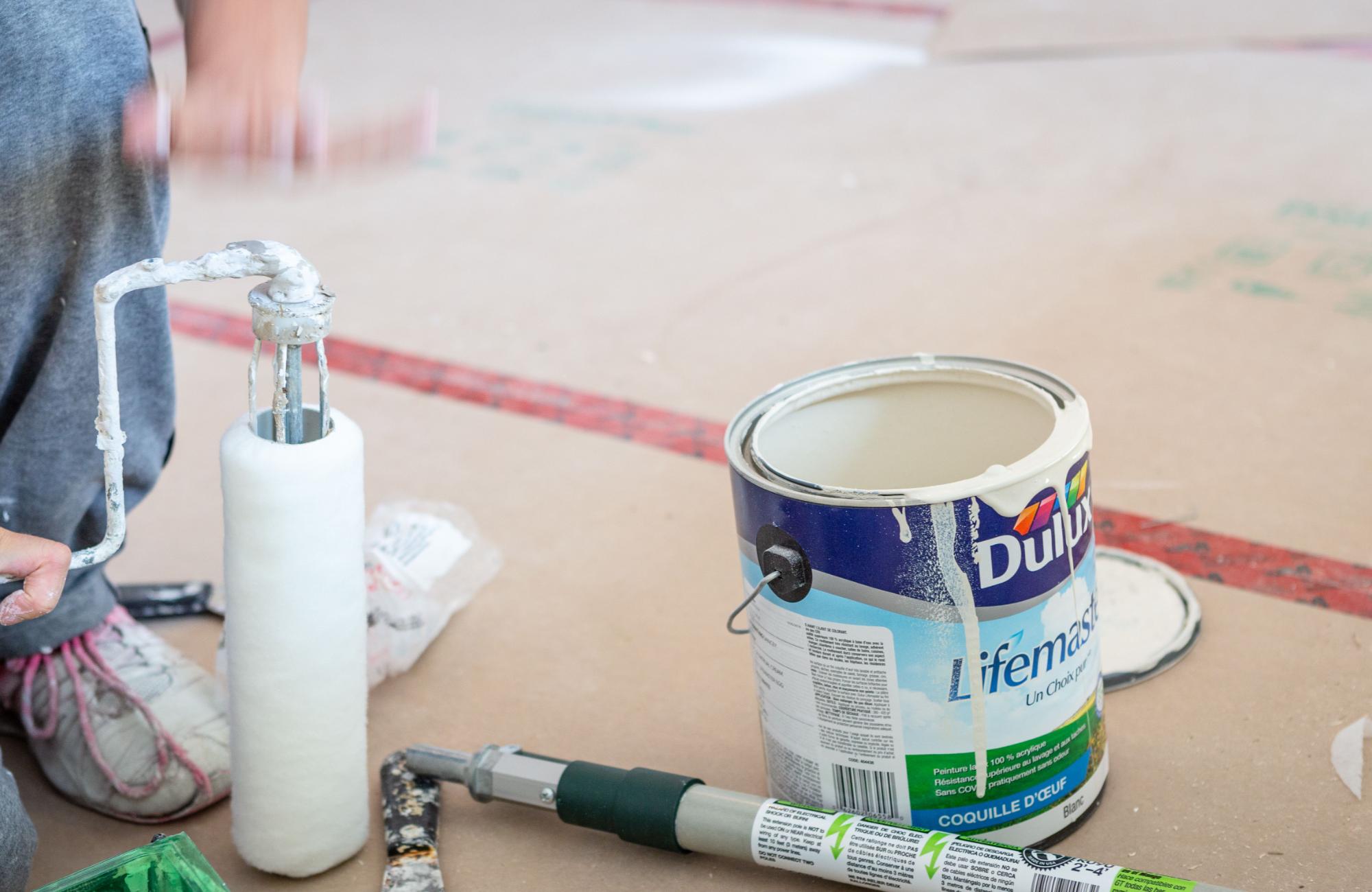
Give Your Home the Makeover It Deserves with Professional Interior Painting from EB Painting
Turn your vision into reality and color your home beautiful. Whether you want to brighten up your space, add warmth, or create a stylish statement, EB Painting is here to bring your ideas to life. Our team of experts knows the art of selecting the perfect hues to enhance every corner of your home. From bold accents to soothing neutrals, we ensure your interior painting experience is seamless and tailored to your style. Let’s make your home as unique as you are. Contact us today to start your transformation.