When your house starts to look a little tired on the outside, a fresh coat of paint can change everything. Choosing the right colours isn’t just about trends—it’s about how your home feels, how it stands out, or how it blends in. The right shade can warm it up, cool it down, or bring out its natural charm. Here are some colour ideas people often overlook—but once you see them on a home, you won’t forget them.
Rich Clay and Terracotta Hues That Ground Your Home Naturally
Clay and terracotta tones bring warmth in the most inviting way. These colours come from nature—think canyon walls, desert rock, or baked earth. When you use them on a house, they feel grounded, warm, and welcoming. They work especially well with wood trim, dark metals, or stone walkways.
Many people don’t realize how versatile these shades can be. Rich clay can look bold on a modern home or soft and rustic on a cottage-style one. Terracotta pairs well with lush green landscaping or neutral accents. These hues make a home look like it belongs right where it is—settled, strong, and full of personality.
Olive and Sage Tones Bringing Organic Texture to Exteriors
Olive and sage shades do something special. They make your house feel like part of the landscape, blending softly with trees, shrubs, and grass. These colours don’t shout for attention, but they draw you in with a sense of calm and balance.
These tones work well with natural wood, black trim, or even stone accents. They offer texture without being too loud. Many homeowners skip green tones because they think they’re too bold—but soft olive and sage prove that greens can be both classy and understated. A home in these shades looks thoughtful, not trendy.
Stormy Greys and Smoky Blues That Add Character Without Noise
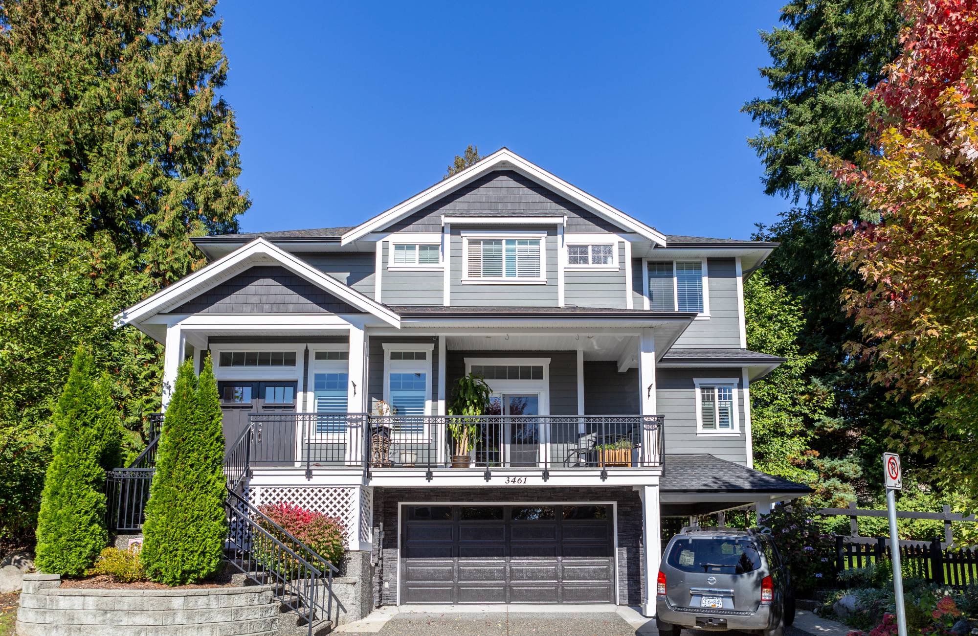
Stormy greys and muted blues bring depth and mood without overwhelming the space. These aren’t the bright or icy tones that can feel cold. They’re cozy and interesting, like a rainy sky or an old slate roof. When painted on the outside of a house, they bring a sense of quiet strength.
These shades look amazing next to crisp white trim, natural stone, or warm wood details. They offer contrast without the drama. If your home gets a lot of light, these deeper tones won’t feel dark—they’ll feel rich. It’s a colour choice that grows on you the longer you see it.
Clean Taupes and Beiges That Offer Subtle Warmth and Flexibility
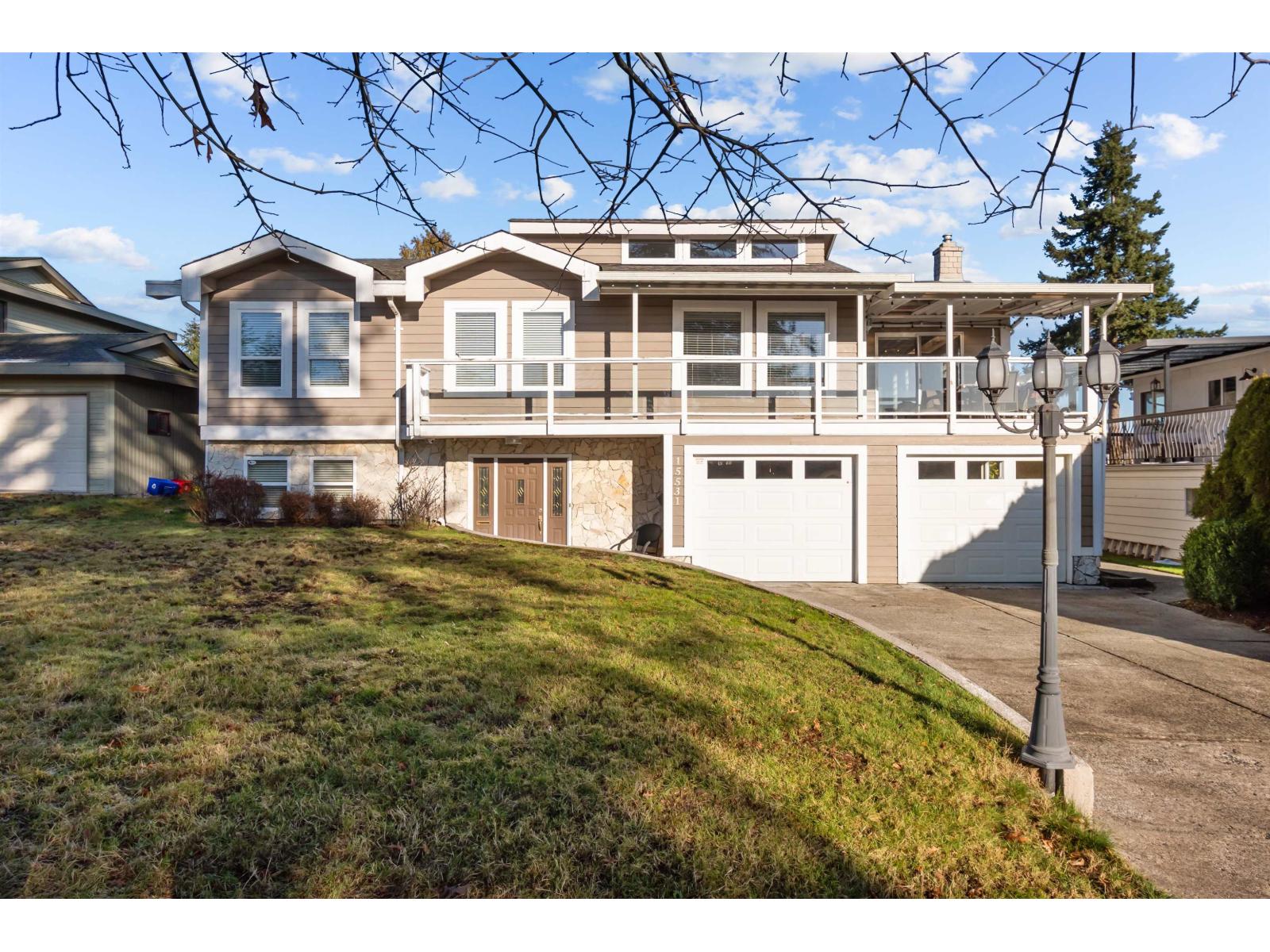
Taupe and beige are often called “safe” colours, but that’s not a bad thing. They’re safe because they always work. These shades don’t try to steal attention. Instead, they give space for other features—like windows, shutters, or porches—to stand out.
What makes taupe and beige great is how flexible they are. You can pair them with dark trim for contrast or light trim for a softer look. They work in full sun or shade. Whether your home is surrounded by city streets or tall trees, these warm neutrals always feel like a good fit.
Crisp Neutrals That Brighten Facades Without Overpowering
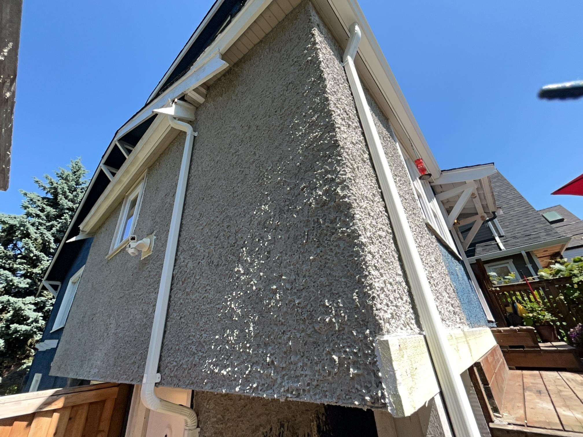
There’s something about a clean, fresh neutral that makes a home look instantly newer. Light greys, soft tans, or pale sandy shades give off a polished look without feeling cold. These colours brighten things up without taking over the show.
People often think brightening a home means going white—but whites can feel too stark or hospital-like. A crisp neutral hits the sweet spot. It’s clean, but still soft. It works with brick, siding, wood, or stucco. These tones can also make small homes feel more spacious and welcoming.
Soft Off-Whites That Pair Seamlessly With Brick or Stonework
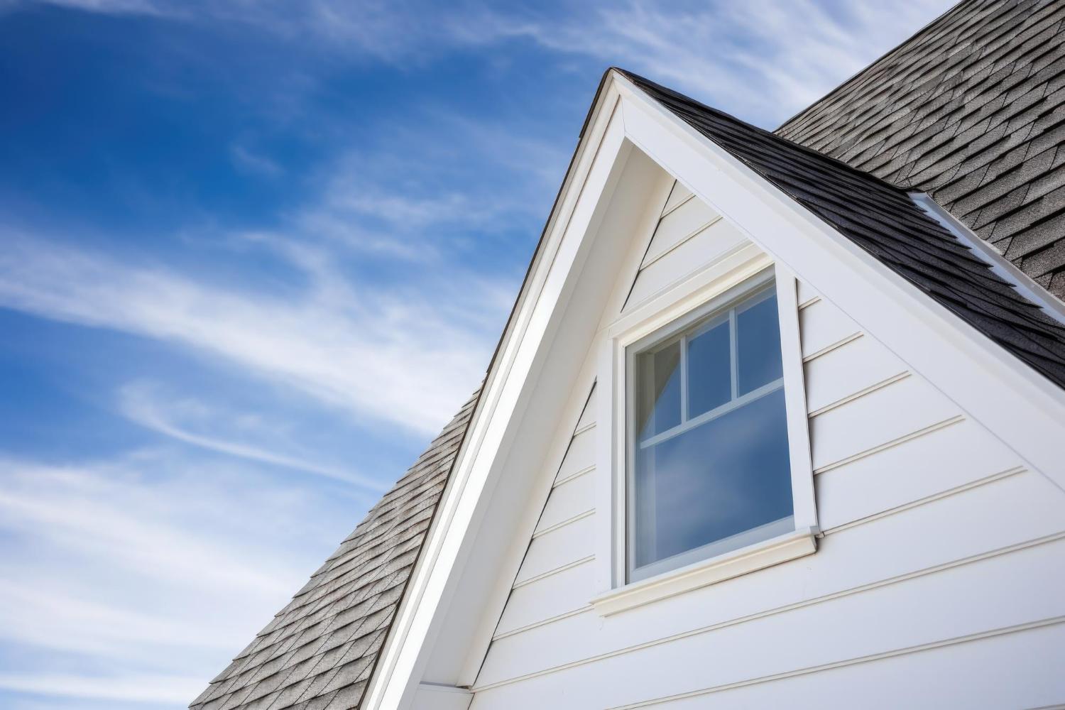
Off-white might sound plain, but it’s secretly one of the most beautiful colour choices out there—especially on homes with brick or stone details. It doesn’t fight with other textures. Instead, it lets them shine. It makes red brick glow and rough stone look elegant.
Soft off-white also works well in any season. It reflects sunlight in the summer and stays cozy in winter light. Unlike bright white, it doesn’t glare or wash out. It offers just enough warmth to feel lived-in, while still looking clean. If your home has a lot of texture, this is the shade that makes it all come together.
Moody Navy and Ink Tones That Create Sophisticated Contrast
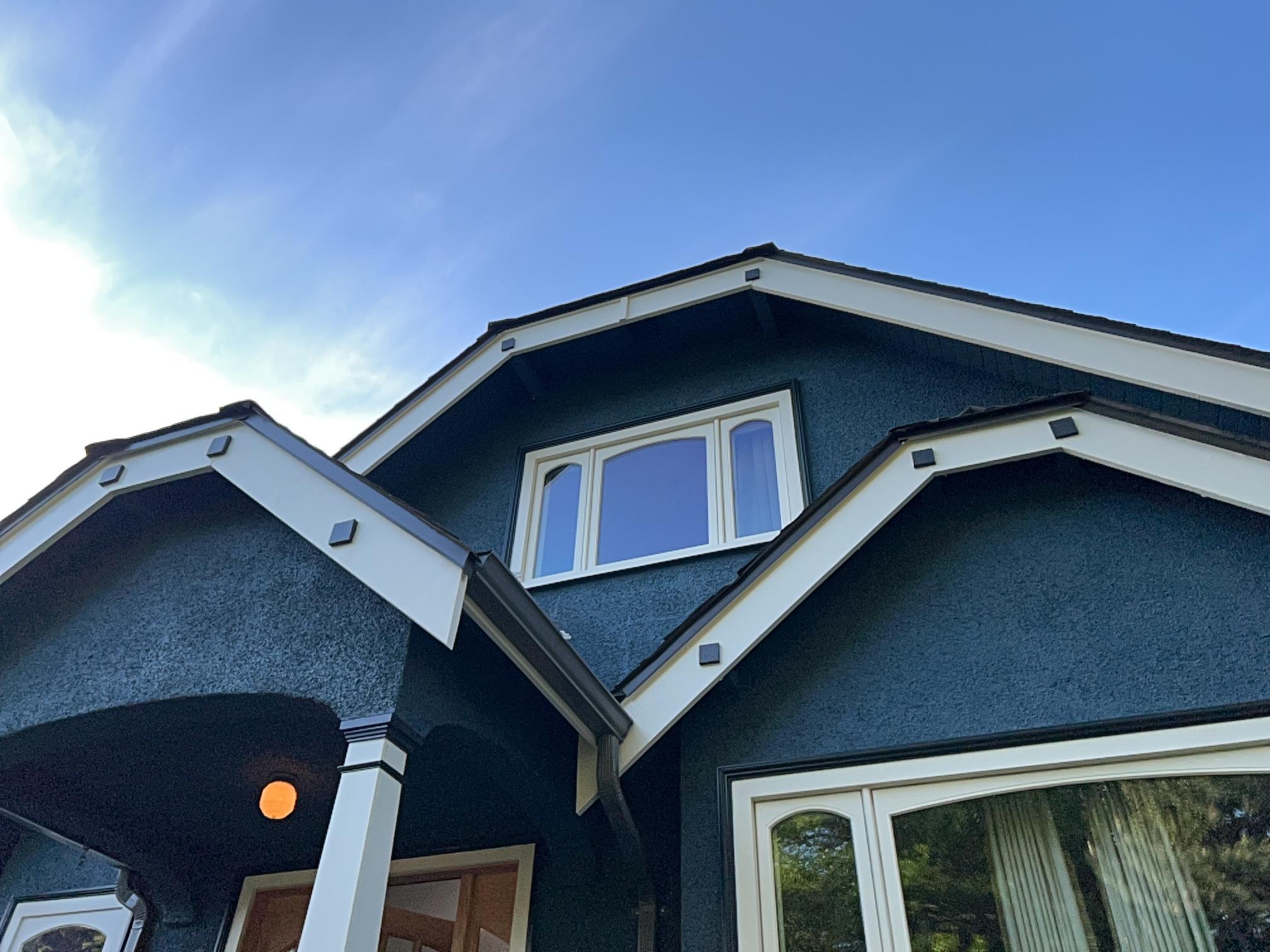
Deep navy or ink-blue tones add instant charm and richness. These colours look confident without being too flashy. They make trim pop, plants look greener, and windows stand out. On the right home, these moody shades can feel modern, traditional, or coastal—all depending on the details around them.
Pairing navy with warm brass lights or wood accents creates a sharp, upscale feel. It also works well with white trim for a classic contrast. Many people are surprised at how these darker tones hold up outdoors. They don’t fade easily, and they always look intentional. If you want your home to feel bold yet balanced, navy is a great choice.
Even Better Painting Makes Choosing Exterior Paint Colours Easy and Enjoyable for Homeowners
Choosing the right exterior paint for your home doesn’t have to be hard. With so many colour options, it’s easy to feel unsure about what will work. But that’s where Even Better Painting comes in. Our team understands how to match the right colours to your home’s style, lighting, and surroundings. Whether you’re looking for something bold or something calm, we know how to bring out the best in your space.
We treat each project with care, from the first brushstroke to the final walkaround. You’ll see the difference in how your home looks and feels. We help you feel confident about your choice—so every time you pull into the driveway, you love what you see. If you’re ready to give your home a fresh, beautiful new look, we’re ready to help.
Contact us today to talk about your ideas, ask questions, or schedule a visit. Let’s make your home look even better together.